
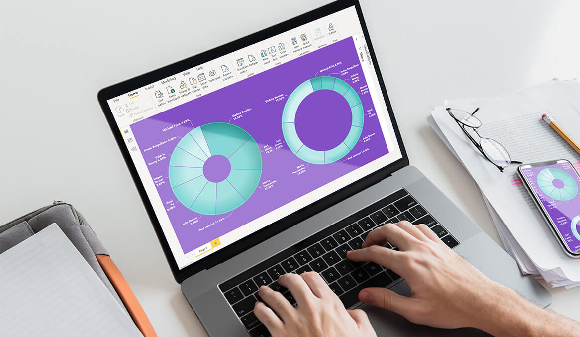
Donut charts, a close cousin of the pie chart, have become increasingly popular in recent years, especially in business analytics. These charts are not just visually appealing but are also highly effective in representing certain types of data. Featuring a hollow center, they provide an additional area where relevant information or data labels can be placed, adding context to the data presented. Businesses, irrespective of their size or industry, have found diverse applications for donut charts, harnessing their ability to convey information in an intuitive manner. In this article, we will delve into some of the most common use cases for the donut chart in the business world.
Market Share Analysis
When businesses aim to understand their position in the market, donut charts can serve as an excellent tool. Market share analysis often involves comparing the share of one’s business against competitors. Representing this data in this chart, with different segments showcasing different competitors, provides a clear and immediate understanding of who holds what percentage of the market. The central hole of the donut can then be used to highlight the total market value or any other pertinent information. By doing so, stakeholders can quickly gauge their relative strengths or weaknesses in the marketplace.
Budget Allocation and Spending
Finance departments regularly use donut charts to showcase budget allocations or spending patterns. For instance, if a company’s annual budget is broken down into various departments like Marketing, R&D, Operations, and HR, a donut chart can effectively display how much each department receives. Similarly, for expenditure analysis, different segments of the donut can represent different expenditure categories. The advantage of using a donut chart here is its ability to instantly reveal the biggest and smallest portions of allocations or expenditures, aiding in quick decision-making.
Survey and Poll Results
Companies often conduct internal or external surveys to gather feedback or understand consumer preferences. The results of such polls, especially when options are mutually exclusive, are perfectly suited for representation in a donut chart. For instance, if a company wants to know its employees’ preferred mode of work (remote, hybrid, or in-office), a donut chart can visually break down the percentage of respondents who favor each option. This aids in understanding the dominant trend without getting lost in numbers.
Product or Service Categories
Retailers, e-commerce platforms, or any business that offers a range of products or services can use donut charts to represent sales or revenue data by category. For instance, an e-commerce platform might use a donut chart to show sales data for categories like Electronics, Apparel, Home Appliances, and Books. By doing so, it becomes easier to identify which categories are the most lucrative and which might need more promotional efforts.
Performance Metrics
Performance, be it of employees, departments, or campaigns, can be effectively showcased using donut charts. If a business is evaluating performance based on a few key metrics, such as sales targets achieved, customer feedback scores, or operational efficiency, each metric can occupy a segment of the donut. This not only provides a comparative view of performance across different metrics but also, with the use of color coding, can quickly indicate areas of excellence or concern.
Customer Segmentation
Modern businesses often segment their customer base to tailor marketing efforts, products, or services. Donut charts can be used to represent such segments, be it based on demographics, buying behavior, or loyalty. For instance, a company might segment its customer base into categories like regular buyers, occasional buyers, and one-time buyers. Using a donut chart to represent the number or percentage of customers in each segment can help marketers and strategists plan their efforts more effectively.
Concluding Thoughts on Donut Chart Usage in Business
In the realm of data visualization, the donut chart has carved a niche for itself, especially in the business context. Its simplicity, combined with its capacity for clear segmentation and comparative analysis, makes it a favored choice for many. While it is essential to choose the right kind of chart based on the data’s nature and the story one aims to tell, there’s no denying that in many scenarios, the donut chart proves to be both effective and engaging. As with any tool, its power lies in its apt application, and for businesses looking to convey information compellingly, the donut chart often emerges as an apt choice.